Many teams only know whether a program is working by opening four or five spreadsheets, copying numbers by hand, and trying to assemble a picture before a meeting the next morning. The data exists somewhere. It just is not anywhere you can see it all at once.
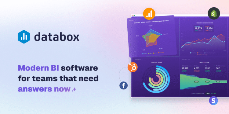
Databox pulls metrics from the tools you already use, including analytics, CRM, spreadsheets, ad accounts, and social platforms, and places them on dashboards that update automatically. It also supports goals, scheduled reports, and alerts, so the right numbers reach the right people without someone compiling them by hand.
The connection to Impact is visibility. The Method holds that impact you cannot see clearly is impact you cannot manage, defend, or improve. The numbers might be real and still be useless if nobody can look at them together and understand what they mean.
What Databox Does Differently
The main difference is automation. A spreadsheet someone updates manually is only as current as the last time they remembered to update it. A live dashboard removes that gap, so what you see reflects what is happening now, not what was happening when someone last had time to compile it.
The second difference is breadth. Databox connects to a large library of data sources and can combine them in one view, which makes it useful beyond marketing: program data, sales figures, financial metrics, and operational numbers can sit side by side.
The Honest Part
Databox will not tell you which metrics matter, and it cannot fix a measurement framework that tracks the wrong things. If your underlying data is messy or your indicators were never clearly defined, a dashboard built on top will just be a more attractive version of the same confusion.
The real work happens before the dashboard: deciding what success looks like and which numbers would show you are getting there. Plans vary by the number of data sources and features, and a free plan is available. Check Databox’s site for current pricing.
Three Principles Worth Keeping in Mind
- Choose fewer metrics than feels comfortable. A dashboard with thirty numbers gets ignored the same way a thirty-page report does.
- Review on a fixed rhythm. Look at it weekly or monthly, not only when something goes wrong.
- Build for a decision. Design each dashboard around the decision it is meant to inform, not as a display of everything that can be measured.
Where This Fits in the Bigger Picture
Impact that is not visible becomes something you argue about instead of discuss. A clear dashboard turns a vague sense that things are going well, or not, into something specific enough to act on and to share without rebuilding the case every time.
The strongest impact work is not the work that produces the most numbers. It is the work where the right numbers reach the right person at the right time. Databox supports that System, which is what makes Impact manageable and credible.
FAQ
Do I need a technical background to use Databox?
No. Connecting common tools is a guided process. The harder work, deciding which metrics matter, is a strategy question rather than a technical one.
Is Databox only for marketing metrics?
No. It works with many kinds of sources, including program, sales, financial, and operational data.